


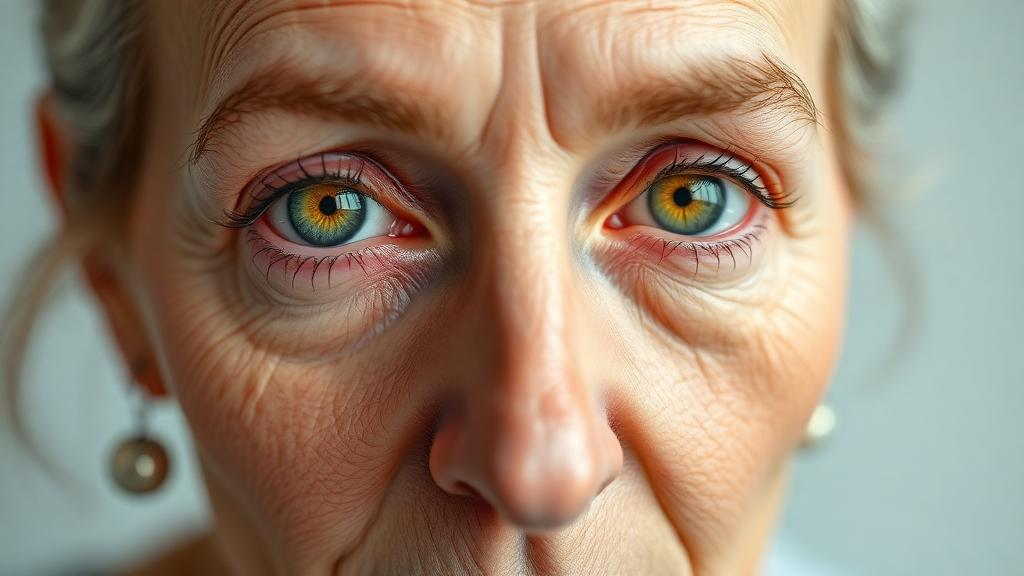
The aging eye is a quietly transforming optical instrument. Decade by decade, the crystalline lens that sits behind the cornea grows denser and progressively yellows, filtering out ever more of the short-wavelength blue light that would otherwise strike the retina. The consequence is that older adults literally do not see the same world as younger people: blues and violets fade toward gray, similar colors crowd together perceptually, and tasks that were once trivial — telling a navy shirt from a black one, sorting pills by the faint tint of their coatings, judging whether fruit is ripe — become slow, effortful, and sometimes impossible. Now a team of researchers at Fudan University in China, working with the lighting manufacturer OPPLE Lighting, has developed a computational model that places these age-related changes at the center of the lighting design process, producing white-light spectra that measurably restore color discrimination for people over seventy while still looking like ordinary, natural white light to everyone else.
The study, published in the Optica Publishing Group journal Optics Express, addresses a blind spot in the standard machinery of lighting science. Conventional color-quality metrics — the tools engineers use to certify whether a lamp renders colors faithfully — rest on a mathematical model of human color vision built around a standard observer whose ocular media transmit light the way a young adult’s eye does. A spectral power distribution that scores perfectly on such a metric may still deliver a distorted signal to an eighty-year-old retina, because the yellowed lens attenuates the short-wavelength end of the spectrum before it ever reaches the cone photoreceptors. As research team leader Qi Dai of Fudan University explained, the lens inside the eye gradually yellows and absorbs more short-wavelength light as people age, which can make similar colors harder to discriminate. The team’s goal, Dai said, was to use new knowledge about how vision changes with age to guide the design of white light that measurably helps older adults distinguish colors while retaining conventional lighting color-quality requirements.
The model works by estimating how easily a person of a given age can tell apart similar colors under a specific illuminant. It takes three inputs and combines them: the spectral power distribution of the light source, the spectral reflectance properties of the colored surfaces being viewed — that is, which wavelengths each object bounces back — and the sensitivities of the eye’s three cone types, adjusted for age. Those cone sensitivities, typically labeled L, M, and S for long, medium, and short wavelengths, feed the model with an age-corrected description of what signals the retina actually receives. When the S cones, which respond to blue light, are starved by a yellowing lens, the differences between their responses to two similar colors shrink, and with them the observer’s ability to see the two objects as distinct. By quantifying that loss computationally, the model can compare candidate light sources not by how bright or white they appear, but by how much color-separating information they preserve for an older visual system.
With the model in hand, the researchers turned it loose on an enormous design space. They evaluated 11,541 possible light spectra, each of which satisfied the standard requirements for white-light chromaticity and color rendering near a color temperature of 5000 kelvin — a neutral, daylight-like white comparable to the standardized D50 reference illuminant used in the color industry. The result was striking: spectra that would be visually indistinguishable by conventional metrics could differ substantially in how well they were predicted to support color discrimination in older adults. Two physically different white lights, both certified as high-quality, both matching at the same color temperature, could nonetheless deliver meaningfully different visual worlds to an aged observer. That gap between conventional quality metrics and age-adjusted performance is precisely the space the new model is designed to exploit.
From that analysis, the team selected two candidate spectra. The first, designated P1, was optimized purely to maximize color discrimination for older eyes. The second, P2, was engineered as a compromise, balancing improved color discrimination against the requirement that familiar object colors still look natural — a critical constraint, because a light that exaggerated or shifted hues would undermine confidence in tasks such as choosing clothing or judging food. For a modeled eighty-five-year-old observer, the P1 spectrum was predicted to recover about 49 percent of the age-related loss in color discrimination, while P2 recovered about 36 percent. Those are substantial recoveries given that both spectra look, on paper and to a younger viewer, like perfectly ordinary neutral-white light.
Simulation, however, is only as good as its predictions, so the team took the spectra into the laboratory. Thirty-four adult volunteers, all aged seventy or above, performed a color-sorting test under three lighting conditions: the P1 spectrum, the P2 spectrum, and an LED-simulated D50 daylight reference. Crucially, the researchers held the practical variables constant across all three conditions — the illuminance, meaning the amount of light falling on the task, and the color temperature were nearly identical in each case. This meant that any difference in performance could be attributed not to brightness or apparent warmth, but to the fine structure of the spectra themselves, the specific mixture of wavelengths each source delivered.
The results confirmed the model’s promise. Both optimized spectra significantly improved performance on the color-sorting test compared with the simulated daylight reference. The improvement was not a subtle statistical artifact confined to averages: at the individual level, 26 of the 34 participants — 76.5 percent — showed better color discrimination under the P1 spectrum, and 22 of 34, or 64.7 percent, improved under P2. For a population in which age-related color vision decline is the norm rather than the exception, a lighting change invisible to conventional metrics produced clear, measurable gains for the majority of older users tested.
The practical implications reach well beyond the laboratory. Dai noted that lighting designed with aging eyes in mind could help older adults remain confident and independent while performing everyday tasks such as reading labels, sorting medications, judging food, or choosing clothing. In a family home or a care facility, such lighting could support older users while retaining the characteristics needed for general use. Because both optimized spectra met conventional criteria for white-light chromaticity and color rendering, they can be installed in spaces shared by people of different ages without younger residents experiencing anything unusual — familiar colors under familiar-looking white light. Dai added that the findings suggest the model could be used to design everyday lighting that makes it easier for older adults to see colors while keeping familiar object colors looking natural, and that since the spectra also satisfy standard white-light and color-rendering requirements, they could serve mixed-age environments directly.
The approach is not limited to lighting. Dai pointed out that the same framework could in principle be extended to capture how displays — the screens of phones, computers, and televisions — appear to older viewers, or to other groups with known differences in spectral sensitivity, although doing so would require dedicated modeling and human testing to validate. Meanwhile, OPPLE Lighting is already working to translate the findings into practical commercial lighting products, moving the research from the journal toward real fixtures. The researchers themselves are careful to note the boundaries of the current evidence: before wider adoption, additional studies should evaluate the approach in everyday settings and at other commonly used illuminances and color temperatures, and testing with people across a wider range of ages, including younger users, would provide valuable information for lighting destined for shared spaces. Even so, the study establishes something the lighting industry has lacked: a practical, validated link between describing how aging vision actually works and designing illumination that supports it. As populations age worldwide, the finding that a well-chosen mixture of wavelengths — invisible to standard metrics, imperceptible to the young — can return nearly half of what time takes from older eyes may reshape how bedrooms, kitchens, hospitals, and care homes are lit.
Subject of Research: Age-adjusted computational modeling of white-light spectra to improve color discrimination in older adults
Article Title: New model informs lighting design that works better for aging eyes
Article References: New model informs lighting design that works better for aging eyes. (n.d.). Original publication
Image Credits: AI Generated
DOI: Not provided
Keywords: aging vision, color discrimination, lighting design, lens yellowing, spectral power distribution, color rendering, Optics Express, LED lighting, cone sensitivities, D50 illuminant, Fudan University, older adults
News Source: Beatrice Stafford. (October 14, 2026). Yellowing Eyes Distort Color: New Lighting Model Restores What Aging Steals. Scienmag.