Analysis finds common errors in pandemic information sharing on social media
Credit: Image courtesy Francesco Cafaro, Indiana University
INDIANAPOLIS — The frantic swirl of coronavirus-related information sharing that took place this year on social media is the subject of a new analysis led by researchers at the School of Informatics and Computing at IUPUI.
Published in the open-access journal Informatics, the study focuses on the sharing of data visualizations on Twitter — by health experts and average citizens alike — during the initial struggle to grasp the scope of the COVID-19 pandemic, and its effects on society. Many social media users continue to encounter similar charts and graphs every day, especially as a new wave of coronavirus cases has begun to surge across the globe.
The work found that more than half of the analyzed visualizations from average users contained one of five common errors that reduced their clarity, accuracy or trustworthiness.
“Experts have not yet begun to explore the world of casual visualizations on Twitter,” said Francesco Cafaro, an assistant professor in the School of Informatics and Computing, who led the study. “Studying the new ways people are sharing information online to understand the pandemic and its effect on their lives is an important step in navigating these uncharted waters.”
Casual data visualizations refer to charts and graphs that rely upon tools available to average users in order to visually depict information in a personally meaningful way. These visualizations differ from traditional data visualization because they aren’t generated or distributed by the traditional “gatekeepers” of health information, such as the Centers for Disease Control and Prevention or the World Health Organization, or by the media.
“The reality is that people depend upon these visualizations to make major decisions about their lives: whether or not it’s safe to send their kids back to school, whether or not it’s safe to take a vacation, and where to go,” Cafaro said. “Given their influence, we felt it was important to understand more about them, and to identify common issues that can cause people creating or viewing them to misinterpret data, often unintentionally.”
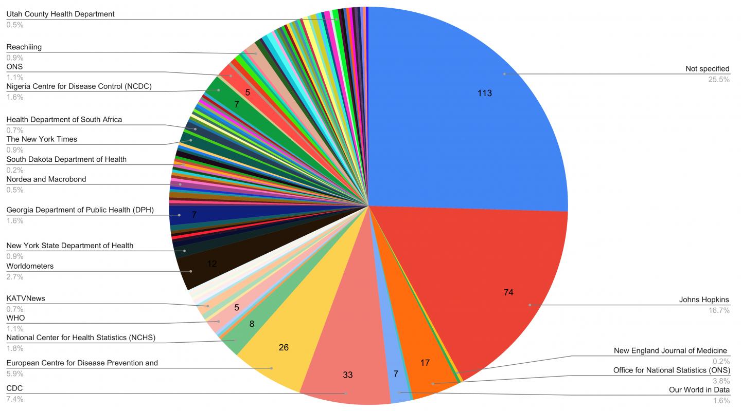
For the study, IU researchers crawled Twitter to identify 5,409 data visualizations shared on the social network between April 14 and May 9, 2020. Of these, 540 were randomly selected for analysis — with full statistical analysis reserved for 435 visualizations based upon additional criteria. Of these, 112 were made by average citizens.
Broadly, Cafaro said the study identified five pitfalls common to the data visualizations analyzed. In addition to identifying these problems, the study’s authors suggest steps to overcome or reduce their negative impact:
- Mistrust: Over 25 percent of the posts analyzed failed to clearly identify the source of their data, sowing distrust in the accuracy. This information was often obscured due to poor design — such as bad color choices, busy layout, or typos — not intentional obfuscation. To overcome these issues, the study’s authors suggest clearly labeling data sources as well as placing this information on the graphic itself rather than the accompanying text, as images are often unpaired from their original post during social sharing.
- Proportional reasoning: Eleven percent of posts exhibited issues related to proportional reasoning, which refers to the users’ ability to compare variables based on ratios or fractions. Understanding infection rates across different geographic locations is a challenge of proportional reasoning, for example, since similar numbers of infections can indicate different levels of severity in low- versus high-population settings. To overcome this challenge, the study’s authors suggest using labels such as number of infections per 1,000 people to compare regions with disparate populations, as this metric is easier to understand than absolute numbers or percentages.
- Temporal reasoning: The researchers identified 7 percent of the posts with issues related to temporal reasoning, which refers to users’ ability to understand change over time. These included visualizations that compared the numbers of deaths from flu in a full year to the number of deaths from COVID-19 in a few months, or visualizations that failed to account for the delay between the date of infection and deaths. Recommendations to address these issues included breaking metrics that depend upon different time scales in separate charts, as opposed to conveying the data in a single chart.
- Cognitive bias: A small percentage of posts (0.5 percent) contained text that seemed to encourage users to misinterpret data based upon the creator’s “biases related to race, country and immigration.” The researchers state that information should be presented with clear, objective descriptions carefully separated from any accompanying political commentary.
- Misunderstanding about virus: Two percent of visualizations were based upon misunderstandings about the novel coronavirus, such as the use of data related to SARS or influenza.
The study also found certain types of data visualizations performed strongest on social media. Data visualizations that showed change over time, such as line or bar graphs, were most commonly shared. They also found that users engaged more frequently with charts conveying numbers of deaths as opposed to numbers of infections or impact on the economy, suggesting that people were more interested in the virus’s lethality than its other negative health or societal effects.
###
Media Contact
Kevin D. Fryling
[email protected]
Related Journal Article
http://dx.
