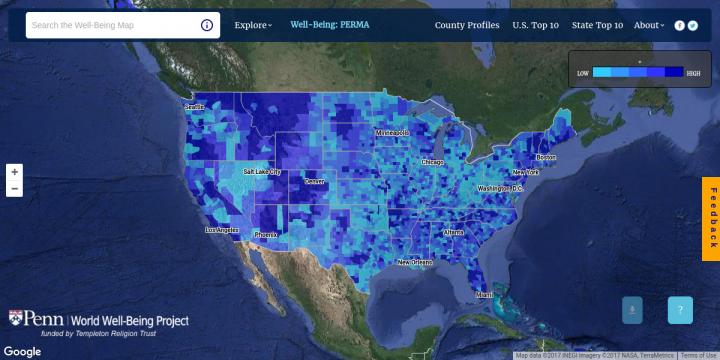
Credit: World Well-Being Project, University of Pennsylvania
It's no secret that communities across the United States differ greatly. Researchers from the University of Pennsylvania's World Well-Being Project sought a simple way to capture, explore and share such differences on a large scale. Their end goal: to provide individuals with valuable insights about where they live and offer comparisons to other communities.
The result is the Well-Being Map, an interactive, freely available tool based on the statistical language analysis of more than 37 billion publicly shared, geo-tagged tweets and on regional demographic data.
For every United States county, the map displays scores for a range of characteristics: well-being and personality traits like openness and extraversion, for example, plus government-reported health and socioeconomic factors such as heart-disease mortality and unemployment. Select a single trait to explore each county's measurements for that trait, or select two traits at once to compare how the traits differ across counties. Top 10 lists show the highest- and lowest-scoring counties in the nation and within every state for each characteristic, and a County Profiles page allows users to enter a county name and see how that county ranks in the nation for all reported characteristics.
If the project's scope sounds massive, that's because it was more than five years in the making, the long-term goal of the World Well-Being Project or WWBP itself, said Johannes Eichstaedt, a Penn postdoctoral fellow who co-founded WWBP, part of the University's Positive Psychology Center, and led the map's creation.
"The World Well-Being Project was established on the idea that we can measure psychological states of large populations in real time by analyzing their social media content," he said. "To get here, we collected huge data sets, built language-based prediction models, ran those models over tweets and demographic information and extracted language patterns associated with specific traits."
Such a process has proven successful in research to this point. In February 2015, Eichstaedt and colleagues published a study in the journal Psychological Science revealing that Twitter language can predict an area's rate of heart disease.
In the past half-decade, the 20 or so Penn scientists involved with the WWBP continue to promote significant research findings that come out of evaluating social media posts. But founding project member Lyle Ungar, a Penn professor with appointments in Medicine, Arts & Sciences, and at Wharton, said he wants the map to reach an even broader audience than did the academic work alone.
"I hope people will just want to play around with it. If I were considering moving somewhere in the U.S., I would want to know how happy people are there," Ungar said. "County-level psychological profiles are really, really important. What people are like in different areas affects economic and health outcomes as well as happiness."
Christie Versagli, WWBP's web development director who designed the map's web interface, said ideally the tool would influence policymaking, too.
She offers as an example a local government wanting to understand the effect of its policy decisions, such as the introduction of new exercise facilities. By analyzing local tweets to measure the well-being within that county before and after the investment, officials could determine its relative impact, such as changes in depression levels. Eichstaedt said the British government has already successfully field-tested similar evidence-based governing.
"The better you can measure," he added, "the better you can make these decisions."
Digging deeper within the map's data could also uncover "personality profiles" of communities, identifying places that need additional support, said Anneke Buffone, WWBP's lead research scientist. "We're looking for areas where we, as a country, can do better," she said. "By analyzing social media, we can get unexpected, in-depth insights into the processes that drive happiness and illness."
Though the map is now up and running, the WWBP team plans to keep adding enhancements. The ultimate goal is a live version showing real-time assessments of Tweets as they occur, especially during major events like a Presidential election, the Super Bowl, or a natural disaster.
"This event is happening right now. Everyone's tweeting about it. How are they feeling about it? Is one region responding differently than another? The map could reveal the immediate impact of an event in several different ways," Versagli said. "This is the type of modern measurement we're moving toward."
Staying true to its name, the World Well-Being Project plans to expand the map beyond the United States, partnering with groups in Spain, Mexico, Britain and China to uncover how social media can reveal well-being findings across the globe. Eichstaedt said he is also using the map's information to delve further into his own research. "We are looking around in the happy U.S. counties and comparing them to happy areas in other parts of the world, to understand how happiness unfolds across different cultures" he said.
Funding for the Well-Being Map was made possible by a grant from the Templeton Religion Trust.
###
Media Contact
Katherine Unger Baillie
[email protected]
215-898-9194
@Penn
http://www.upenn.edu/pennnews
Original Source
https://news.upenn.edu/news/penn-interactive-map-shows-community-traits-built-more-37-billion-tweets
############
Story Source: Materials provided by Scienmag


