
Credit: Kashnitsky, I., & Schöley, J.
Demographers from the Higher School of Economics and the University of Southern Denmark have created a detailed colour map of population ageing in European countries; a collection of demographic stories, it uses colour coding to indicate the varying stages of population ageing across Europe. By looking at the map, you can easily spot areas with a higher concentration of older people, countries with the youngest populations and the main destinations for workforce flows. https://www.sciencedirect.com/science/article/pii/S0140673618311942?via%3Dihub
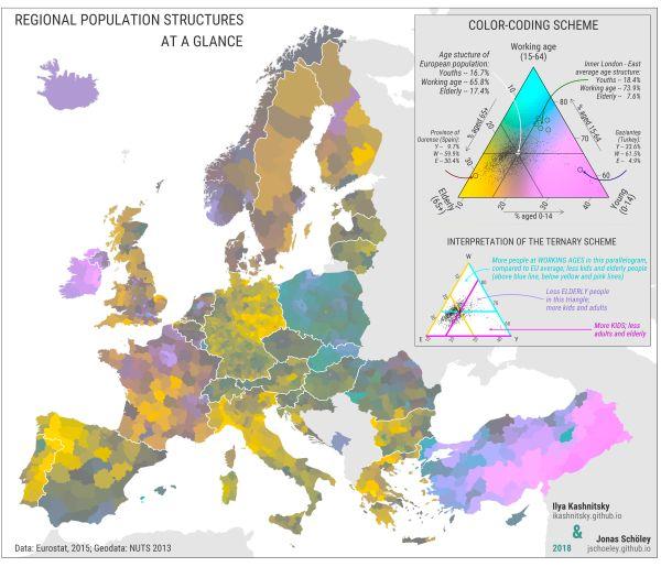
Europe's Demographic 'Passport'
Europe is ageing: according to UN estimates, half the region's population are aged 43 and over. This general statistic, however, does not reflect the diversity of age distribution across Europe. According to more detailed Eurostat data, 17.4% of Europeans are aged 65 and over, 16.7% are children aged 14 and younger, and 65.8% are working-age people (aged 15 to 64), but even these numbers are averages, and don't give the full, nuanced picture.
A color-coded map based on Eurostat's detailed regional data and published in The Lancet provides a visual representation of age distribution across and within European countries.
According to Kashnitsky, the map (Figure 1) 'provides a snapshot of population structures in Europe' showing different countries' demographic landscapes at a glance. This cross-section also reveals a historical perspective: by looking at the 'collection of stories', one can get an idea of demographic changes in European countries over time. The predominance of a certain palette of colours indicates both a particular stage of demographic development and recent processes such as an influx of immigrants or an exodus of the workforce.
Ages are colour coded: yellow stands for the elderly, pink for children, and blue for working-age people. The grey palette indicates the average European age (42.8), i.e. a mixture of colours reflects a mixture of ages. Brighter colours on the map stand for areas where the local population's age distribution differs from the European average.
Thus, bright yellow spots in certain areas of France, Germany, Italy and Spain indicate a large proportion of elderly residents – western European countries are rapidly ageing. In contrast,
Kurdistan in the southeastern part of Turkey is coloured in pink and purple indicating a large number of children and high birth rates. This data tells us that Kurdistan has not yet completed its demographic transition from high birth and death rates to lower ones.
Boundaries between Countries
The visual differences between countries in terms of age structure can be so pronounced as to resemble demarcation lines. For example, Eastern Europe, particularly Poland and Slovakia, have large working-age populations (marked in turquoise and blue), in sharp contrast to the neighbouring Germany which has a high concentration of elderly people in its eastern part near the border with Poland.
Also obvious are differences between the east, west and south of Europe. Southern European countries with low birth rates have many yellow areas but no pink ones. This is consistent with the UN data on total fertility rates (TFR, average number of births per woman of fertile age) in this part of Europe, at around 1.3 in Spain, Portugal and Italy, far below the fertility rate of 2.1 required for simple continuation of the population.
According to Kashnitsky, ageing in Europe is uneven, with rates varying vastly across countries. Different factors, from immigration to religion, are behind the demographic mosaic seen in the map.
Judging by its pink and purple colours, Ireland is fairly young; indeed, its TFR of 1.81 (Eurostat, 2016) is one of the region's highest, which is largely due to the influence of the Catholic Church and restriction of abortions, according to the researcher. This does not mean, however, that Ireland is immune from the global trend towards lower fertility rates: its TFR decreased noticeably and rapidly from 2.5 in 2010 to 1.85 in 2015.
Diversity within Countries
The map also reveals demographic contrasts within countries. 'By zooming in on the map, one can see a clear boundary between the two Belgiums: Flanders in the north and Wallonia in the south', Kashnitsky notes. The population of Wallonia is younger, while that of Flanders is closer to the Central European average age'.
A demographically distinct area inside Finland coloured in bright purple is populated by Laestadians, extremely conservative Lutherans. 'According to Finnish demographers, in terms of family planning, these people seem to believe in having as many children as God can give them', the author explains.
The coastal Mediterranean regions of Spain differ markedly from its central part in terms of having a higher concentration of the working-age population due to massive immigration in the 2000s. The map helps visualise a variety of demographic processes, including urbanisation.
Centre vs. Provinces, Cities vs. Villages
Within countries, differences can be observed not only between parts of a particular country but generally between the centre and provinces. Capital cities and other urban centres have always attracted a working-age population, and the map reflects this tendency. 'Highly urbanised areas and capital cities tend to attract young professionals', the researcher notes, 'while young families with children often move from the city centre to the suburbs'. The latter phenomenon can be clearly observed around Paris and London where population ageing is less pronounced.
In contrast, remote provinces tend to age at a faster pace, with young people leaving and the proportion of older people increasing. The same is true of rural areas.
'Colours are created using our 'tricolore' R package. This package, we hope, will allow researchers from different fields of science to easily display colour ternary data compositions', Kashnitsky concludes.
In the future, the researchers plan to examine and map the regional age structures of Russia and the U.S.
###
Media Contact
Liudmila Mezentseva
[email protected]
7-926-313-2406
@HSE_eng
http://www.hse.ru/en/
Original Source
https://iq.hse.ru/en/news/223964790.html http://dx.doi.org/10.1016/S0140-6736(18)31194-2


